
Skip the intro · jump to the list ↓
By the end of this list you’ll have sixteen band logo ideas worth sketching out this weekend. No design degree required!
I scrolled through way more pins than I want to admit before narrowing this down. Some looked amazing but needed a graphic design certificate to pull off, so those got cut immediately.
The ones that made the final cut are doable with basic tools, a steady hand and maybe one trip to the craft store.
A few work great hand drawn. Others translate perfectly to a t-shirt design or a sticker for your guitar case.
Whether you’re naming an actual band or just love the aesthetic, there’s something here for you. Who doesn’t love a good logo, am I right?
Grab a notebook and start doodling as you scroll. Under each idea you’ll find the little details that make it work plus a link to the full tutorial.
BAND LOGO IDEAS
Minimalist Circle Band Emblem
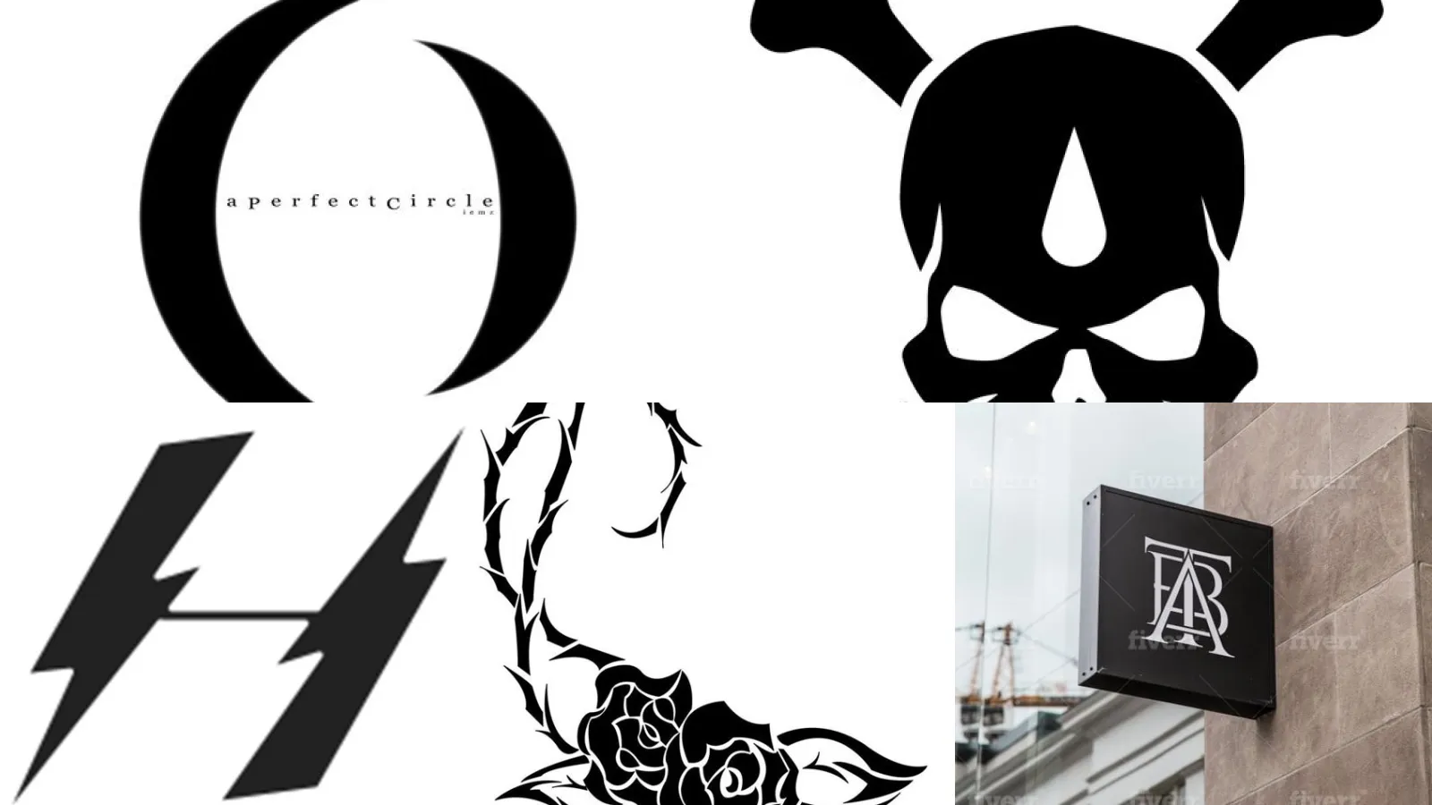
We are starting off strong with a minimalist circle emblem. Clean lines and one bold symbol inside a ring, that is the whole formula.
It reads perfectly small on a pick or a patch. I still tease him about it.
- Reads great even tiny
- Works on a guitar pick
- One color keeps it sharp
- No shading needed
Punk Rock Spray Paint Logo
Punk rock spray paint logos are pure attitude. Drips, splatters and rough edges give the whole thing a rebellious energy on purpose.
I tried faking the spray effect digitally once and gave up in ten minutes. Grab an actual can from the craft aisle instead, it saves your patience. This one’s for you if clean and polished isn’t the vibe.
- Rough on purpose
- Stencil from the craft aisle
- Drips are a feature not a mistake
Vintage Rock Band Crest
This vintage crest style borrows from old motorcycle badges and it works every single time. Banners, laurel leaves, a bold center shield, all in one.
The whole thing felt instantly established, even though they had formed last month, lol! Not bad for a band that had only practiced twice.
- Instant old school
- Ribbon banner adds weight
- Looks good in one color
- Ages well on merch
Skull And Crossbones Emblem
Skulls never go out of style for this kind of thing. Crossbones underneath keep it classic instead of cartoonish.
Coworkers who saw mine on a mug assumed it was a metal band logo. It was actually for a trivia team, haha! No shame in that.
Keep the eye sockets simple. Too much detail and the whole symbol gets muddy at small sizes.
- Classic and a little menacing
- Simple eye shapes read best
- Works in black and white
Retro Sunset Band Badge
This retro sunset badge is all warm gradients and a horizon line cutting through the middle. It feels like a road trip playlist cover.
I always default to orange into pink into deep purple. My playlist covers look basically identical at this point, haha! How cute is that consistency?
- Looks like a summer road trip
- Gradient does most of the work
- Great for album art too
Wings And Shield Logo
Wings and a shield together make one of the most recognizable rock symbols out there. Think heraldry meets highway.
I always sketch the shield first, then build the wings out from the sides. It keeps everything balanced instead of lopsided. This is the design that photographs best on a leather jacket patch, hands down.
- Heraldry meets highway
- Shield first, wings after
- Great as an iron on patch
Neon Glow Band Symbol
Neon glow symbols look like they are buzzing straight off a dive bar wall. Bright outlines against a black background do all the heavy lifting.
I could not stop staring at it! This one is basically impossible to make boring, lol!
- Buzzes like a dive bar sign
- Black background is non negotiable
- Bright pink or teal reads best
Tribal Pattern Band Mark
Tribal patterns bring a bold graphic edge without needing a single word of text. Sharp angles, repeating shapes, total confidence.
She still swears it is the best decision she made at twenty, haha! Who could argue with that kind of loyalty?
- Bold with zero text needed
- Thick lines read from far away
Sacred Heart Band Icon
The sacred heart icon packs flames on top and thorns wrapped around the middle. My tattoo artist friend says it is one of her most requested designs. It somehow carries a ton of emotion in one small symbol. That contradiction is exactly why bands keep coming back to it.
- Soft and fierce at once
- Flames add movement
- Works beautifully in gold foil
Lightning Bolt Band Symbol
Is it really a rock band without a lightning bolt somewhere? Not in my book! There’s a reason this symbol shows up on stage gear constantly.
Draw it thick and jagged rather than thin. A skinny bolt just looks like a checkmark! Nobody wants that.
- The stage gear classic
- Thick and jagged reads better
Flame Lettering Rock Logo
Flame lettering turns your band name itself into the whole logo. Every letter licks upward like it’s about to catch fire.
I spent an embarrassing amount of time once just trying to keep my own band name legible under the flames. The payoff is worth every minute. Talk about talent!
- Letters that catch fire
- Sketch letters first, flames after
Vintage Typewriter Font Logo
This typewriter font logo goes the opposite direction entirely. No flames, no skulls, just crisp vintage type stamped like an old concert flyer.
It’s the one I’d pick for a folk or indie project, honestly. Understated but still memorable. Doesn’t that feel like a relief after all those flames?
- Old flyer energy
- Slightly faded ink look helps
- Pairs well with kraft paper
Rose Thorns Band Design
Roses with thorns wrapped through the stem give a design instant romance and instant danger in the same breath.
I’ve seen this one on more tattoo flash sheets than I can count. My own arm has a version of it, actually. It just works everywhere!
- Romance and danger together
- Thorns add the edge
Geometric Wolf Head Logo
Geometric wolf heads break the animal down into angular shapes instead of realistic fur and detail. It reads as bold and modern instantly.
I keep the angles sharp and consistent so the face holds together at a glance. This is the design that looks incredible printed big on a bass drum head.
- Modern and angular
- Sharp angles hold it together
Cassette Tape Band Icon
Cassette tape icons are pure nostalgia and they work whether or not anyone in the band has ever actually owned one, lol!
My drummer collects actual cassettes nobody in the band can even play. It is a fun nod to mixtape culture that somehow still feels current. How great is that kind of dedication?
- Pure mixtape nostalgia
- Nostalgic without trying hard
Monogram Initials Band Logo
Last but definitely not least, a monogram initials logo. Two or three letters interlocked into one clean mark, simple as that.
It’s the design that scales down best of everything on this list, from a tiny pin all the way up to a stage backdrop.
This is where I’d start if the whole thing feels overwhelming. Same!
- Scales down the smoothest
Just a little note - some of the links on here may be affiliate links, which means I might earn a small commission if you decide to shop through them (at no extra cost to you!). I only post content which I'm truly enthusiastic about and would suggest to others.
And as you know, I seriously love seeing your takes on the looks and ideas on here - that means the world to me! If you recreate something, please share it here in the comments or feel free to send me a pic. I'm always excited to meet y'all! ✨🤍
Xoxo Emma